Pure Android
Most developers want to distribute their apps on multiple platforms. As you plan your app for Android, keep in mind that different platforms play by different rules and conventions. Design decisions that make perfect sense on one platform will look and feel misplaced in the context of a different platform. While a "design once, ship anywhere" approach might save you time up-front, you run the very real risk of creating inconsistent apps that alienate users. Consider the following guidelines to avoid the most common traps and pitfalls.
Don't mimic UI elements from other platforms
Platforms typically provide a carefully designed set of UI elements that are themed in a very distinctive fashion. For example, some platforms advocate rounded corners for their buttons, others use gradients in their title bars. In some cases, elements may have the same purpose, but are designed to work a bit differently.
As you build your app for Android, don't carry over themed UI elements from other platforms and don't mimic their specific behaviors. Review the Building Blockssection in this styleguide to learn about Android's most important UI elements and the way they look in the system default themes. Also examine Android's platform apps to get a sense of how elements are applied in the context of an app. If you want to customize the theme of UI elements, customize carefully according to your specific branding - and not according to the conventions of a different platform.
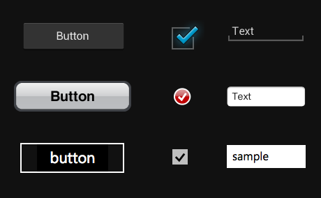
Sampling of UI elements from Android, iOS and Windows Phone 7.
Don't carry over platform-specific icons
Platforms typically provide sets of icons for common functionality, such as sharing, creating a new document or deleting.
As you are migrating your app to Android, please swap out platform-specific icons with their Android counterparts.
You can find a wide variety of icons for use in your app on the Downloads page.
Sampling of icons from Android, iOS and Windows Phone 7.
Don't use bottom tab bars
Other platforms use the bottom tab bar to switch between the app's views. Per platform convention, Android's tabs for view control are shown in action bars at the top of the screen instead. In addition, Android apps may use a bottom bar to display actions on a split action bar.
You should follow this guideline to create a consistent experience with other apps on the Android platform and to avoid confusion between actions and view switching on Android.
For more information on how to properly use action bars for view control, see Action Bars.
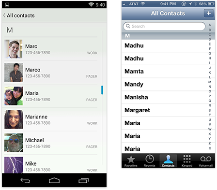
Android dialer with tabs in an action bar vs. bottom tabs in iOS.
Don't hardcode links to other apps
In some cases you might want your app to take advantage of another app's feature set. For example, you may want to share the content that your app created via a social network or messaging app, or view the content of a weblink in a browser. Don't use hard-coded, explicit links to particular apps to achieve this. Instead, use Android's intent API to launch an activity chooser which lists all applications that are set up to handle the particular request. This lets the user complete the task with their preferred app. For sharing in particular, consider using theShare Action Provider in your action bar to provide faster access to the user's most recently used sharing target.
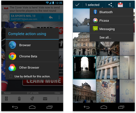
Link to other apps with the activity chooser or use the Share Action Provider in the action bar.
Don't use labeled back buttons on action bars
Other platforms use an explicit back button with label to allow the user to navigate up the application's hierarchy. Instead, Android uses the main action bar's app icon for hierarchical navigation and the navigation bar's back button for temporal navigation. For more information, please review theNavigation pattern.
Follow this guideline to provide a consistent navigation experience across the platform.
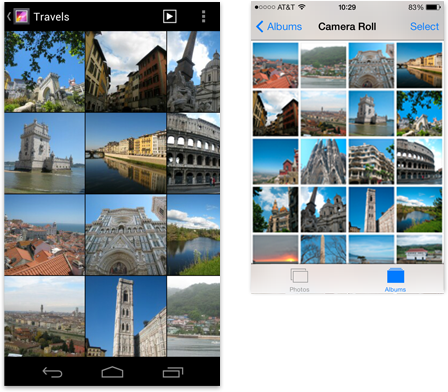
Android action bar with up caret vs. iOS labeled "Back" button.
Don't use right-pointing carets on line items
A common pattern on other platforms is the display of right-pointing carets on line items that allow the user to drill deeper into additional content.
Android does not use such indicators on drill-down line items. Avoid them to stay consistent with the platform and in order to not have the user guess as to what the meaning of those carets may be.
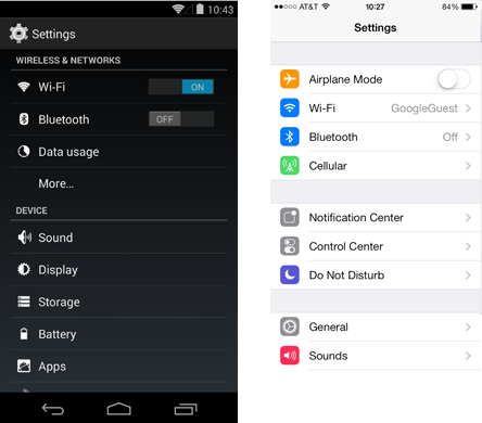
Android settings without right-pointing carets in line items vs. iOS settings.
Device Independence
Remember that your app will run on a wide variety of different screen sizes. Create visual assets for different screen sizes and densities and make use of concepts such as multi-pane layouts to appropriately scale your UI on different device form factors.
Source: http://developer.android.com


