
Touch Feedback
Use color and illumination to respond to touches, reinforce the resulting behaviors of gestures, and indicate what actions are enabled and disabled.
Whenever a user touches an actionable area in your app, provide a visual response. This lets the user know which object was touched and that your app is "listening".
States
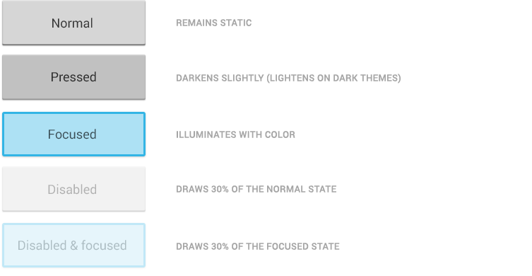
Most of Android's UI elements have touch-feedback built in, including states that indicate whether touching the element will have any effect.
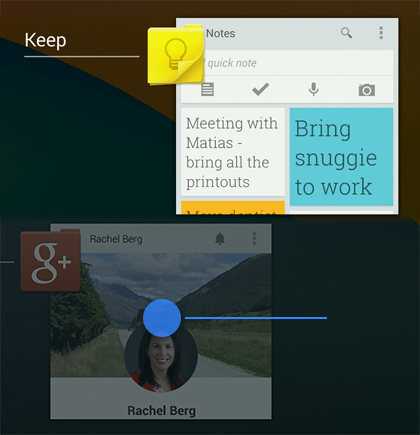
Communication
When your objects react to more complex gestures, help users understand what the outcome of the operation will be. For example, in Recents, when you start swiping a thumbnail left or right, it starts to dim. This helps the user understand that swiping will cause the item to be removed.
Boundaries
When users try to scroll past the upper or lower limit of a scrollable area, communicate the boundary with a visual cue. For example, if a user attempts to scroll past the first home screen panel, the screen content tilts to the right to indicate that further navigation in this direction is not possible. Many of Android's scrollable UI widgets (e.g. lists or grid lists) already have support for boundary feedback built in. If you are building custom, keep boundary feedback in mind and provide it from within your app.
Metrics and Grids
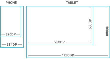
Devices vary not only in physical size, but also in screen density (DPI). To simplify the way you design for multiple screens, think of each device as falling into a particular size bucket and density bucket. The size buckets are handset(smaller than 600dp) and tablet (larger than or equal 600dp). The density buckets are LDPI, MDPI, HDPI, and XHDPI. Optimize your application's UI by designing alternative layouts for some of the different size buckets, and provide alternative bitmap images for different density buckets.
Space considerations
Devices vary in the amount of density-independent pixels (dp) they can display.
To see more, visit the Screen Sizes and Densities Device Dashboard.
48dp Rhythm
Touchable UI components are generally laid out along 48dp units.

Why 48dp?
On average, 48dp translate to a physical size of about 9mm (with some variability). This is comfortably in the range of recommended target sizes (7-10 mm) for touchscreen objects and users will be able to reliably and accurately target them with their fingers.
If you design your elements to be at least 48dp high and wide you can guarantee that:
- your targets will never be smaller than the minimum recommended target size of 7mm regardless of what screen they are displayed on.
- you strike a good compromise between overall information density on the one hand, and targetability of UI elements on the other.
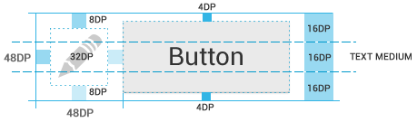
Mind the gaps
Spacing between each UI element is 8dp.
Examples
Source: http://developer.android.com/
No comments:
Post a Comment