Thursday, March 14, 2013

Pure Android


Pure Android


Most developers want to distribute their apps on multiple platforms. As you plan your app for Android, keep in mind that different platforms play by different rules and conventions. Design decisions that make perfect sense on one platform will look and feel misplaced in the context of a different platform. While a "design once, ship anywhere" approach might save you time up-front, you run the very real risk of creating inconsistent apps that alienate users. Consider the following guidelines to avoid the most common traps and pitfalls.

Don't mimic UI elements from other platforms

Platforms typically provide a carefully designed set of UI elements that are themed in a very distinctive fashion. For example, some platforms advocate rounded corners for their buttons, others use gradients in their title bars. In some cases, elements may have the same purpose, but are designed to work a bit differently.
As you build your app for Android, don't carry over themed UI elements from other platforms and don't mimic their specific behaviors. Review the Building Blockssection in this styleguide to learn about Android's most important UI elements and the way they look in the system default themes. Also examine Android's platform apps to get a sense of how elements are applied in the context of an app. If you want to customize the theme of UI elements, customize carefully according to your specific branding - and not according to the conventions of a different platform.

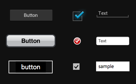
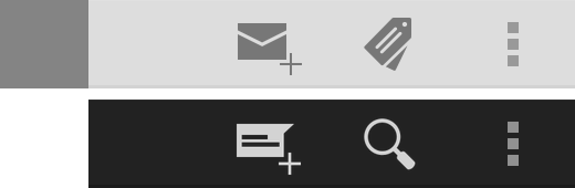
Sampling of UI elements from Android, iOS and Windows Phone 7.

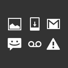
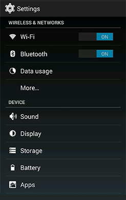
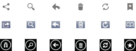
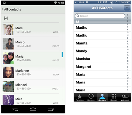
Don't carry over platform-specific icons

Platforms typically provide sets of icons for common functionality, such as sharing, creating a new document or deleting.
As you are migrating your app to Android, please swap out platform-specific icons with their Android counterparts.
You can find a wide variety of icons for use in your app on the Downloads page.

Sampling of icons from Android, iOS and Windows Phone 7.

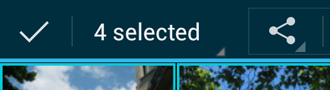
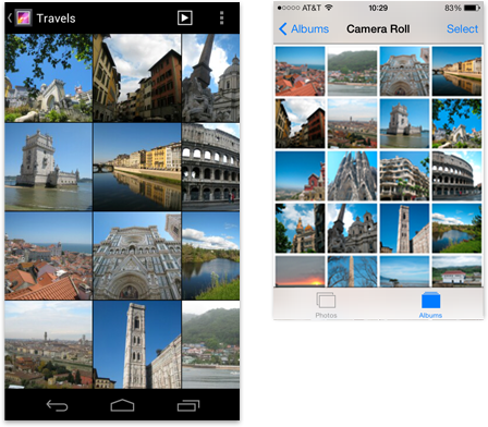
Don't use bottom tab bars

Other platforms use the bottom tab bar to switch between the app's views. Per platform convention, Android's tabs for view control are shown in action bars at the top of the screen instead. In addition, Android apps may use a bottom bar to display actions on a split action bar.
You should follow this guideline to create a consistent experience with other apps on the Android platform and to avoid confusion between actions and view switching on Android.
For more information on how to properly use action bars for view control, see Action Bars.

Android dialer with tabs in an action bar vs. bottom tabs in iOS.

Don't hardcode links to other apps

In some cases you might want your app to take advantage of another app's feature set. For example, you may want to share the content that your app created via a social network or messaging app, or view the content of a weblink in a browser. Don't use hard-coded, explicit links to particular apps to achieve this. Instead, use Android's intent API to launch an activity chooser which lists all applications that are set up to handle the particular request. This lets the user complete the task with their preferred app. For sharing in particular, consider using theShare Action Provider in your action bar to provide faster access to the user's most recently used sharing target.

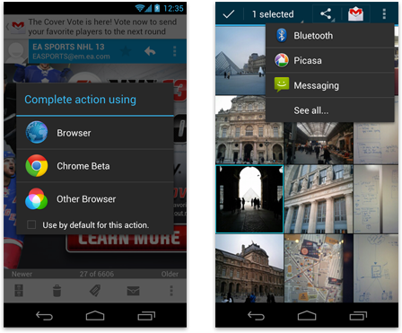
Link to other apps with the activity chooser or use the Share Action Provider in the action bar.

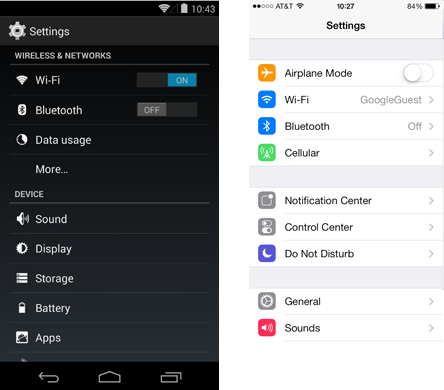
Don't use labeled back buttons on action bars

Other platforms use an explicit back button with label to allow the user to navigate up the application's hierarchy. Instead, Android uses the main action bar's app icon for hierarchical navigation and the navigation bar's back button for temporal navigation. For more information, please review theNavigation pattern.
Follow this guideline to provide a consistent navigation experience across the platform.

Android action bar with up caret vs. iOS labeled "Back" button.

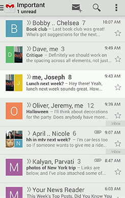
Don't use right-pointing carets on line items

A common pattern on other platforms is the display of right-pointing carets on line items that allow the user to drill deeper into additional content.
Android does not use such indicators on drill-down line items. Avoid them to stay consistent with the platform and in order to not have the user guess as to what the meaning of those carets may be.

Android settings without right-pointing carets in line items vs. iOS settings.
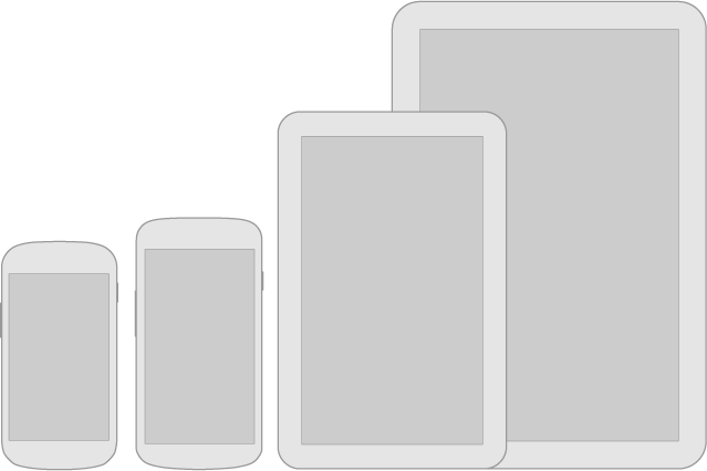
Device Independence


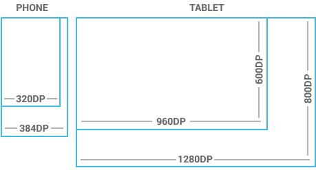
Remember that your app will run on a wide variety of different screen sizes. Create visual assets for different screen sizes and densities and make use of concepts such as multi-pane layouts to appropriately scale your UI on different device form factors.
Source: http://developer.android.com

Wednesday, March 13, 2013

New in Android


New in Android


Jelly Bean - Android 4.1


Notifications

Notifications have received some notable enhancements in Android 4.1:
  • Users can act on notifications immediately from the drawer
  • Notifications are more flexible in size and layout
  • A priority flag helps sort notifications by importance
  • Notifications can be collapsed and expanded
The base notification layout has not changed, so app notifications designed for versions earlier than Jelly Bean still look and work the same. Check the updated Notifications page for more details.

Resizable Application Widgets

Widgets are an essential aspect of home screen customization, allowing "at-a-glance" views of an app's most important data and functionality right from the user's home screen. Android 4.1 introduces improved App Widgets that can automatically resize and load different content based upon a number of factors including:
  • Where the user drops them on the home screen
  • The size to which the user expands them
  • The amount of room available on the home screen
You can supply separate landscape and portrait layouts for your widgets, which the system inflates as appropriate when the screen orientation changes. The Application Widgets has useful details about widget types, limitations, and design considerations.

Accessibility

One of Android's missions is to organize the world's information and make it universally accessible and useful. Our mission applies to all users-including people with disabilities such as visual impairment, color deficiency, hearing loss, and limited dexterity.
The new Accessibility page provides details on how to design your app to be as accessible as possible by:
  • Making navigation intuitive
  • Using recommended touch target sizes
  • Labeling visual UI elements meaningfully
  • Providing alternatives to affordances that time out
  • Using standard framework controls or enable TalkBack for custom controls
  • Trying it out yourself
You can supply separate landscape and portrait layouts for your widgets, which the system inflates as appropriate when the screen orientation changes. The [Application Widgets] (should be link) has useful details about widget types, limitations, and design considerations.

Ice Cream Sandwich - Android 4.0


Navigation bar

Android 4.0 removes the need for traditional hardware keys on phones by replacing them with a virtual navigation bar that houses the Back, Home and Recents buttons. Read theCompatibility pattern to learn how the OS adapts to phones with hardware buttons and how pre-Android 3.0 apps that rely on menu keys are supported.

Action bar

The action bar is the most important structural element of an Android app. It provides consistent navigation across the platform and allows your app to surface actions.

Multi-pane layouts

Creating apps that scale well across different form factors and screen sizes is important in the Android world. Multi-pane layouts allow you to combine different activities that show separately on smaller devices into richer compound views for tablets.

Selection

The long press gesture which was traditionally used to show contextual actions for objects is now used for data selection. When selecting data, contextual action bars allow you to surface actions.

Tuesday, March 12, 2013

Iconography


An icon is a graphic that takes up a small portion of screen real estate and provides a quick, intuitive representation of an action, a status, or an app.

Launcher


The launcher icon is the visual representation of your app on the Home or All Apps screen. Since the user can change the Home screen's wallpaper, make sure that your launcher icon is clearly visible on any type of background.

Sizes & scale

  • Launcher icons on a mobile device must be 48x48 dp.
  • Launcher icons for display on Google Play must be512x512 pixels.

Proportions

  • Full asset, 48x48 dp

Style

Use a distinct silhouette. Three-dimensional, front view, with a slight perspective as if viewed from above, so that users perceive some depth.

Action Bar


Action bar icons are graphic buttons that represent the most important actions people can take within your app. Each one should employ a simple metaphor representing a single concept that most people can grasp at a glance.
Pre-defined glyphs should be used for certain common actions such as "refresh" and "share." The download link below provides a package with icons that are scaled for various screen densities and are suitable for use with the Holo Light and Holo Dark themes. The package also includes unstyled icons that you can modify to match your theme, in addition to Adobe® Illustrator® source files for further customization.

Sizes & scale

  • Action bar icons for phones should be 32x32 dp.

Focal area & proportions

  • Full asset, 32x32 dp
    Optical square, 24x24 dp

Style

Pictographic, flat, not too detailed, with smooth curves or sharp shapes. If the graphic is thin, rotate it 45° left or right to fill the focal space. The thickness of the strokes and negative spaces should be a minimum of 2 dp.

Colors

Colors: #333333
Enabled: 60% opacity
Disabled: 30% opacity
Colors: #FFFFFF
Enabled: 80% opacity
Disabled: 30% opacity

Small / Contextual Icons


Within the body of your app, use small icons to surface actions and/or provide status for specific items. For example, in the Gmail app, each message has a star icon that marks the message as important.

Sizes & scale

  • Small icons should be 16x16dp.

Focal area & proportions

  • Full asset, 16x16 dp
    Optical square, 12x12 dp

Style

Neutral, flat, and simple. Filled shapes are easier to see than thin strokes. Use a single visual metaphor so that a user can easily recognize and understand its purpose.

Colors

Use non-neutral colors sparingly and with purpose. For example, Gmail uses yellow in the star icon to indicate a bookmarked message. If an icon is actionable, choose a color that contrasts well with the background.

Notification Icons


If your app generates notifications, provide an icon that the system can display in the status bar whenever a new notification is available.

Sizes & scale

  • Notification icons must be24x24 dp.

Focal area & proportions

  • Full asset, 24x24 dp
    Optical square, 22x22 dp

Style

Keep the style flat and simple, using the same single, visual metaphor as your launcher icon.

Colors

Notification icons must be entirely white. Also, the system may scale down and/or darken the icons.
Source: http://developer.android.com

Monday, March 11, 2013

Touch Feedback


Touch Feedback


Use color and illumination to respond to touches, reinforce the resulting behaviors of gestures, and indicate what actions are enabled and disabled.
Whenever a user touches an actionable area in your app, provide a visual response. This lets the user know which object was touched and that your app is "listening".

States


Most of Android's UI elements have touch-feedback built in, including states that indicate whether touching the element will have any effect.

Communication

When your objects react to more complex gestures, help users understand what the outcome of the operation will be. For example, in Recents, when you start swiping a thumbnail left or right, it starts to dim. This helps the user understand that swiping will cause the item to be removed.

Boundaries

When users try to scroll past the upper or lower limit of a scrollable area, communicate the boundary with a visual cue. For example, if a user attempts to scroll past the first home screen panel, the screen content tilts to the right to indicate that further navigation in this direction is not possible. Many of Android's scrollable UI widgets (e.g. lists or grid lists) already have support for boundary feedback built in. If you are building custom, keep boundary feedback in mind and provide it from within your app.

Metrics and Grids

Devices vary not only in physical size, but also in screen density (DPI). To simplify the way you design for multiple screens, think of each device as falling into a particular size bucket and density bucket. The size buckets are handset(smaller than 600dp) and tablet (larger than or equal 600dp). The density buckets are LDPIMDPIHDPI, and XHDPI. Optimize your application's UI by designing alternative layouts for some of the different size buckets, and provide alternative bitmap images for different density buckets.

Space considerations

Devices vary in the amount of density-independent pixels (dp) they can display.

48dp Rhythm


Touchable UI components are generally laid out along 48dp units.

Why 48dp?

On average, 48dp translate to a physical size of about 9mm (with some variability). This is comfortably in the range of recommended target sizes (7-10 mm) for touchscreen objects and users will be able to reliably and accurately target them with their fingers.
If you design your elements to be at least 48dp high and wide you can guarantee that:
  • your targets will never be smaller than the minimum recommended target size of 7mm regardless of what screen they are displayed on.
  • you strike a good compromise between overall information density on the one hand, and targetability of UI elements on the other.

Mind the gaps

Spacing between each UI element is 8dp.

Examples


Source: http://developer.android.com/

Sunday, March 10, 2013

Devices and Displays


Devices and Displays


Android powers millions of phones, tablets, and other devices in a wide variety of screen sizes and form factors. By taking advantage of Android's flexible layout system, you can create apps that gracefully scale from large tablets to smaller phones.

Be flexible

Stretch and compress your layouts to accommodate various heights and widths.

Optimize layouts

On larger devices, take advantage of extra screen real estate. Create compound views that combine multiple views to reveal more content and ease navigation.

Assets for all

Provide resources for different screen densities (DPI) to ensure that your app looks great on any device.

Strategies

So where do you begin when designing for multiple screens? One approach is to work in the base standard (normal size and MDPI) and scale it up or down for the other buckets. Another approach is to start with the device with the largest screen size, and then scale down and figure out the UI compromises you'll need to make on smaller screens.

Themes


Gmail in Holo Light.

Settings in Holo Dark.

Talk in Holo Light with dark action bar.
Themes are Android's mechanism for applying a consistent style to an app or activity. The style specifies the visual properties of the elements that make up your user interface, such as color, height, padding and font size. To promote greater cohesion between all apps on the platform, Android provides three system themes that you can choose from when building apps for Ice Cream Sandwich:
  • Holo Light
  • Holo Dark
  • Holo Light with dark action bars
Applying these themes will go a long way in helping you to build apps that fit right into the general visual language of Android.
Pick the system theme that best matches the needs and design aesthetics for your app. If your desire is to have a more distinct look for your app, using one of the system themes as a starting point for your customizations is a good idea. The system themes provide a solid foundation on top of which you can selectively implement your own visual stylings.
Source:http://developer.android.com

Friday, March 8, 2013

UI Overview


UI Overview


Android's system UI provides the framework on top of which you build your app. Important aspects include the Home screen experience, global device navigation, and notifications.
Your app will play an important part in keeping the overall Android experience consistent and enjoyable to use. At the end of this chapter we introduce the main elements for achieving this goal in your app.
Read on for a quick overview of the most important aspects of the Android user interface.

Home, All Apps, and Recents


Home screen

Home is a customizable space that houses app shortcuts, folders and widgets. Navigate between different home screen panels by swiping left and right.
The Favorites Tray at the bottom always keeps your most important shortcuts and folders in view regardless of which panel is currently showing.
Access the entire collection of apps and widgets by touching the All Apps button at the center of the Favorites Tray.

All apps screen

The All Apps screen lets you browse the entire set of apps and widgets that are installed on your device.
Users can drag an app or widget icon from the All Apps screen and place it in any empty location on any Home screen.

Recents screen

Recents provides an efficient way of switching between recently used applications. It provides a clear navigation path between multiple ongoing tasks.
The Recents button at the right side of the navigation bar displays the apps that the user has interacted with most recently. They are organized in reverse chronological order with the most recently used app at the bottom.
Switch to an app by touching it. Remove an item by swiping left or right.

System Bars


The system bars are screen areas dedicated to the display of notifications, communication of device status, and device navigation. Typically the system bars are displayed concurrently with your app. Apps that display immersive content, such as movies or images, can temporarily hide the system bars to allow the user to enjoy full screen content without distraction.

  1. Status Bar

    Displays pending notifications on the left and status, such as time, battery level, or signal strength, on the right. Swipe down from the status bar to show notification details.
  2. Navigation Bar

    New for phones in Android 4.0, the navigation bar is present only on devices that don't have the traditional hardware keys. It houses the device navigation controls Back, Home, and Recents, and also displays a menu for apps written for Android 2.3 or earlier.
  3. Combined Bar

    On tablet form factors the status and navigation bars are combined into a single bar at the bottom of the screen.

Notifications


Notifications are brief messages that users can access at any time from the status bar. They provide updates, reminders, or information that's important, but not critical enough to warrant interrupting the user. Open the notifications drawer by swiping down on the status bar. Touching a notification opens the associated app. 

Notifications can be expanded to uncover more details and relevant actions. When collapsed, notifications have a one-line title and a one-line message.The recommended layout for a notification includes two lines. If necessary, you can add a third line.
Swiping a notification right or left removes it from the notification drawer.

Common App UI


A typical Android app consists of action bars and the app content area.
  1. Main Action Bar

    The command and control center for your app. The main action bar includes elements for navigating your app's hierarchy and views, and also surfaces the most important actions.

  2. View Control

    Allows users to switch between the different views that your app provides. Views typically consist of different arrangements of your data or different functional aspects of your app.
  3. Content Area

    The space where the content of your app is displayed.
  4. Split Action Bar

    Split action bars provide a way to distribute actions across additional bars located below the main action bar or at the bottom of the screen. In this example, a split action bar moves important actions that won't fit in the main bar to the bottom.

    Information Source:http://developer.android.com/